Rock Music Mind Map
I decided to create a band with the music style of rock as personally that's genre of music I enjoy but also its such specific music style that I feel I'd be able to create a band which is unique and identifiable; the audience will be able to tell straight away that this is a rock band. I also decided to go with rock because its genre which will always be popular and important, the idea of 'rock will never die' is significant. There's also so many rock bands in the industry that I will be able to get inspiration from them and create a band will similarities and what an audience would be attracted to.
I created this mind map to get ideas for my rock band, I looked closely at past and present rock music influences, fashion icons in the rock industry, different forms of rock and the genres conventions.
Rock Music Mood Board
The task for today's lesson was to create mood boards which relate to our genre of band, the mood board
should include images of bands similar to our own, images which symbolise our genre; because Ellie and I choose to go down the rock route, we'd find images of roses and skulls as they symbolise it. Also any logos or album covers which relate to rock would be good to add to our mood boards. I created my mood board on Pinterest as I wanted to find and document my searchings all onto one area, it also is a good website to find a range of images under one search rather then having to find multiple different areas of it under multiple different Google searches.
this is the link to my Pinterest account:
http://uk. Pinterest.com/halfordbarden/rock-music/
Screen grabs from Pinterest Board
General: these screen grabs are of general rock related images I found
Fashion: these screen grabs are of rock musics influence on fashion
Bands/Artists: these screen grabs are of bands/artists in the rock industry
Logos: these screen grabs are of bands/artists famous logos
Album Artwork: these screen grabs are of bands/artists album artwork
This mood board was created by Ellie as a form of documenting any graphical ideas we found which related to our rock band.
Band Name
This decision was one of the most hardest to decided as it had to fit with the theme but also be unique and memorable. We wanted the band name to be exciting and something fresh but still have the same connotations of a stereotypical rock band. We also thought it would be a good idea to have a band name which symbolizes the definition of rock and also be able to create a logo which would go relate to it and look interesting and striking.
Band Name Mind Map
This mind map shows the idea creating for the rock bands name, one half of the mind map showed things related to the names like religion drugs ect and also what the bands name had to be for example the most successful rock artists use a name which is unique, catchy ect. The other half of the mind map was the actual names Ellie and I thought of, we decided to go down the route of dark, rebellious names which symbolize rock music. Some examples of names we thought of were Black Acid, Black Religious, Maleficent Youth before we finally decide our chosen band name after getting back feedback from the class focus group.
Constraints When Managing Production Of A Media Product
Permission to Publish Photographic Images Consent Form
Photography release forms are used to secure permission to publish images of people, including children, as well as certain property.
If you are planning to take pictures to publish on a website, in a publication or on any other type of materials that might be distributed, it's essential to get signed photography release forms that grant you permission to publish likenesses of the people and objects in your photos. Here are four printable photography release documents that you can use, each one created for a specific situation.
When you want permission from an adult to publish his or her own image on a website or in some other publication, you'll need to have the person sign a general photography release form.
While youngsters may think it's cool to have their picture taken, you can't use the fact that a child gave you permission to photograph him or her as consent to publish the images. You'll need to get written consent from a parent or guardian of any child you photograph whose picture you want to publish.
If you want to publish photos of property that does not belong to you, it's essential to get the owner of said property to sign a release document. You'll need to use this form if you want to publish a photo of someone's dog, your neighbor's garden, an interesting car you see driving down the street and any other types of property. Click the image below to download a general photo release document you can use.
Logo Design
In the lesson of Friday the 17th of October, the task was to create our band logo and/or the music companies logo. I decided to create a symbolic logo for our band's name as often rock musicians and group have a specific logo but as well as symbolise which people relate these bands to, for example The Rolling Stones use a red mouth/tongue to symbolise the famous band, Nivana uses a yellow smiley face, Misfits uses a white skull outline and The xx uses a thick white kiss/x as there bands symbol. I started my logo design with creating a few drafts on paper before straight away creating a logo on software as I wanted to fully design my logo first before jumping into actually creating it, also I felt I could get more inspiration through drafting ideas.
Examples of Rock Logo's
I really like these rock music logo's as they all relate to the specific bands, I feel logos are better as they are visually more exciting and make a band more unique and interesting. Some of my favourite logos are Misfits, Ramones, ACDC and Kiss.
Misfits Logo; Idea 1 Inspiration
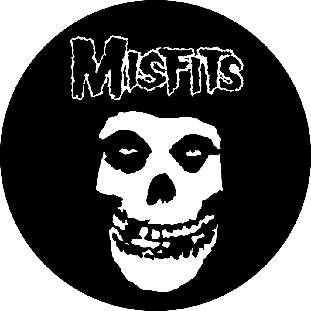
One particular logo from a rock band which I really like and have got inspiration for my own band from is Misfits. The Misfits are an American band often recognized as the progenitors of the horror punk subgenre, blending punk rock and other musical influences with horror film themes and imagery. Founded in 1977 in Lodi, New Jersey by singer and songwriter Glenn Danzig, the group had a fluctuating lineup during its first six years with Danzig and bassist Jerry Only as the only consistent members. During this time they released several EPs and singles, and with Only's brother Doyle as guitarist, the albums Walk Among Us (1982) and Earth A.D./Wolfs Blood (1983), both considered touchstones of the early-1980s hardcore punk movement. The Misfits disbanded in 1983 and Danzig went on to form Samhain and then the eponymous Danzig. Several albums of reissued and previously unreleased material were issued after the group's dissolution, and their music became influential to punk rock, heavy metal, and alternative rock music of the late 1990s and early 2000s. The famous Misfits logo was inspired by two iconic trademarks from the horror film industry. The skull was appropriated from a poster for the film series ‘The Crimson Ghost.’ The typeface resembles that of the movie magazine ‘Famous Monsters of Filmland.’
Idea 1 Logo

This is the first logo idea design. Ellie and I based this idea on famous rock band Misfits as we really liked there typography which is unique and different. We really liked the grungy feel to the logo and the skull as well with the typography makes it look cool and scream rock and roll. We created our logo through Adobe Photoshop which we felt was the best software for creating our band logo. We searched through pages of font generating website 'Dafont' to find the perfect font for our first idea logo. The chosen font is called 'misfits' which ironically is the most similar font we found to the rock band Misfits. After we downloaded the font onto Photoshop we started created multiple different logo ideas using the same font. We played around with a few ideas like putting the two words from the band name onto of each other, next to each other and slightly apart intil we found the layout we best preferred. We found our favorite layout to be the zigzagged style as it looked similar to a rock logo and had a professional feel. We decided to experiment with adding symbols onto the typography as we thought it added a more interesting touch to the logo. We thought for a while what shape would look best and the most 'rocky'. We finally decided on a star symbol as we wanted our logo to look unique and after band research we found that the star symbol wasn't the most popular symbol used. Our chosen logo design for the first idea is the bottom logo as we felt it was overall the most professional logo and it looked the most grungy rock music style.
Led Zeppelin; Idea 2 Inspiration

The second band which Ellie and I got inspiration from for our second band design is from Led Zeppelin. We really liked the bands use of symbols and typography as we thought it was unique and interesting, also was a cool way of creating an iconic and memorable look to the band. Led Zeppelin was one of the first rock bands ever to use symbols rather then writing on album covers, art work and logos making the band become recognized and well known through these symbols. We decided we wanted to create a logo with the use of symbols as well as typography as we felt it would make the overall logo different and quirky. The symbols used in Led Zeppelins art work have relation to the genre of rock music with symbols which have involvement in the satanic religion ect so we felt we should incorporate this in our logo. Led Zeppelin were an English rock band formed in London in 1968. The group consisted of guitarist Jimmy Page, singer Robert Plant, bassist and keyboardist John Paul Jones, and drummer John Bonham. Their heavy, guitar-driven sound, rooted in blues on their early albums, has drawn them recognition as one of the progenitors of heavy metal, though their unique style drew from a wide variety of influences, including folk music. Led Zeppelin are widely considered one of the most successful, innovative and influential rock groups in history. They are one of the best-selling music artists in the history of audio recording; various sources estimate the group's record sales at 200 to 300 million units worldwide. With RIAA-certified sales of 111.5 million units, they are the second-best-selling band in the United States. Each of their nine studio albums placed on the Billboard Top 10 and six reached the number-one spot. Rolling Stone magazine described them as "the heaviest band of all time","the biggest band of the '70s"and "unquestionably one of the most enduring bands in rock history".They were inducted into the Rock and Roll Hall of Fame in 1995; the museum's biography of the band states that they were "as influential in that decade [the 1970s] as the Beatles were in the prior one". The band used symbols in there fouth album which they decided would be untitled and use symbols instead. The four symbols represented each band member which led to the album being referred to variously as the Four Symbols logo, Four Symbols, The Fourth Album, Untitled, Runes, The Hermit, and ZoSo (which was derived from Page's symbol).
Idea 2 Logo

This is our second logo design which we created through Adobe Photoshop and with the use of typography generating website 'Dafont'. We started the process by searching through several pages of Dafont to try and find the best font which relates to our Led Zeppelin inspiration and also has a style of rock. After searching for a while we finally found the best font which we thought looked original but also professional. After found the font we downloaded it onto our other fonts in Photoshop and started playing around with different logos, changing the font size, colour and also mixing up between lower case and capital letter words. One of our first designs from our second logo idea was the most simplest as we were just firstly experimenting with the font. We placed the two words of 'black acid' next to each other and made the symbols which we used as similar to the actual letters so people who weren't aware of the band could read it and understand it. We liked the symbols which were in the font as they had a rock feel and looked like something used for a rock band. Some of other experiments with our second font was changing around the positioning of the words which wad done in the second version of the logo. We placed two words in a zig zag position, mixed up some of the symbols and also connected the two words so the logo looked joined together; we liked this version as we felt it was the most slick. Our final experiment was with mixing up the colour of the logo, before we kept it completely black which we didn't think was very exciting so we changed it to completely white with a black outline, this was our favorite experiment from idea 2 as we liked the idea of placing the white logo onto a black background for band art work.
Focus Group Research
As part of our research we were set the task to complete a focus group which gave us more information on our band and also let us understand what our target audience thoughts on the idea of Black Acid. These are the screen grabs from the presentation which we showed to our focus group so they got a clearer understanding of what our band is, the genre, the intentions and the overall idea and whether or not they like it and if its the style of band they would be interested in.
The feedback we got from our focus group was mixed. We started the focus group by discussing our bands genre and the bands which relate that genre, the feedback for this was positive as people agreed with our reasonings for choosing a band with the style of rock music. The focus group also thought we had a good mixture of bands we got inspiration from which we were pleased about. We also shared mind maps we created for our bands name and also our genre, we wanted our focus group to get a better understanding of the band we wanted to create. We went on to share our chosen band name which caused a mixed reaction. We originally were going to call our band 'Maleficent Youth' which we thought was a good name but didn't fit our style of rock as it was too feminine and mellow for a traditional rock band. So before our focus group we changed the name to 'Black Acid', at the time we thought we had found the perfect name as it was grungey and mysterious. It also just genuinely sounded like a name for a rock band so we felt confident that it would go down well with the focus group. When we discussed the name of 'Black Acid' with the focus group it lead to mixed emotions, some people really liked the name as they felt it fitted a rock band and the name related to rock musics culture. Others disagreed and felt it was overly rocky and sounded like a name for a metal band (similar to Slipknot and Metallica) which is the complete wrong genre of rock we were going for. Other people said it sounded too dark and could create a wrong impression to what we want our band. After hearing all this feedback we had taken it all on board and decided to change our band name to something which fitted the rock genre more. We asked the focus group some ideas and they came up with Black Chime, Black Diamonds and Rock Dynamics. We thought all these names were good but not 100% suited for our band so we decided to take on further research. We also shared the logo designs with the focus group where they all gave positive feedback saying how they thought the logo designs were good and actually looked like a logo you would see for a rock band. We were pleased with this feedback as we worked hard on our logo so wanted positive comments. We got a lot of useful information from our focus group and were overall pleased with the mixed comments as it allows us to improve on areas which are lacking and get a better understanding of our target audience.
Band Name Change
.jpeg)
After we received our feedback from the focus group we decided to completely change the bands name. Although at first we were slightly disappointed with having to change the name as we originally really liked Black Acid but after taking the feedback into consideration we thought it was for the best. We started mindmapping a new name and also got help from our graphic lecturer Barry, who helped us a lot with thinking of a name. We looked at the Periodic Table to try and find some inspiration for our band name, we liked this idea as we thought it would make it sound unique and slightly strange which we were going for. We liked Zicon as its really unique but we thought it could sound to similar to Led Zeppelin. We mindmapped about the name, the logo and the CD as we were in a way back to square one. After researching and thinking for a while we finally found the name we were going to use, we decided on Rock Capacity as we think its a unique and catchy name. It's a two worded name which a lot of rock bands tend to do as it makes it sound more catchy and memorable. Rock obviously relates to our genre of band and people will straight away know that our band is of the genre of rock. Capacity means a variety of different things but we specifically looked at these two meanings; a. the ability to receive, hold, or absorb and b. a measure of this ability; volume. We feel pleased and confident with this name as its a lot more relatable to our style of band.
This is a photo of some of the notes we created when trying to think of a new band name.
Logo Change
This is our changed and final logo design. We decided to stick with the same style of logo using the same template we created for 'Black Acid'. However we changed the name after feedback from our focus group. We created our final logo design through the same process as we did with our other logo designs. Through Photoshop and using font generating website 'Dafont'. Ellie and I are pleased with our final logo design as we feel it truly shows our rock music influences and the research we did through rock bands. We feel this logo was our best which we created as the design looks professional and realistic as we used influences from Led Zeppelins symbol typography.
Final Logo Design
Album Cover Design
In the lesson of Friday the 7th of November we started creating our album cover designs. We started by creating draft idea designs on paper as we wanted to gain inspriation and ideas first before we straight away started designing our album covers. I wanted to create album covers which looked simple but detailed; only using one main image but which is really interesting and unique. I want to use one main image onto a black or white background with the logo above the image. I got inspiration from multiple different album covers including AC/DC Black Ice, Led Zeppelin Zoso, Iron Maiden Killers, Sublime 40oz To Freedom and Linkin Park The Hunting Party.
Photography
We were set a task during study week to take photographs for our artists album cover. During Study Week I went to Bristol for the weekend and whilst I was there I decided to actually take some photos because I found some really good areas which I felt looked like places a rock band would visit and would be seen in an album cover. I took a mixture of graffiti work, pubs, cafe's and some scenery which was disrupted as I thought it looked grungey and had a rock feel. These are some of my favourite photos I took which I will definitely be using in the Rock Capacity album cover. I will edit all these images on Photoshop to improve the overall quality.
CD Cover Design
This is our CD Cover Design which we created through Adobe Photoshop and Illustrator. All the images used on our CD Cover were our own photography. We felt the images we took had related to our genre which is why we thought they'd look best on our album cover. We got design inspiration from Black Sabbaths albums as they tend to use a variety of photography rather than just graphics.

This is our front cover of our CD cover design which we created through Photoshop and Illustrator, we edited the actual photo by increasing the photo quality, the contrast and the brightness. We used illustrator to incorporate the Rock Capacity over the original 'The Lanes' sign, we gained colours from the original sign and added them to the Rock Capacity design. This is another photo which we edited for our album cover, we increased the colour quality and changed the colours lines from blue to bright pink. We feel confident with these photos as we used original photography and edited it themselves.
Final CD Cover Design

EP MGMT Logo

This is our logo for Ellie and I's management company logo. We created the name 'EP' through combining our first letters of our names which we found created an interesting and unique management name. We created the actual logo through Adobe Illustrator and designed it around inspiration from previous logos we looked at. We feel confident with our logo as we feel its a professional looking logo and of a high quality standard.
Stick On Tattoos
Stick on tattoos was one media product Rock Capacity created. We thought stick on tattoos was an interesting and unique idea as rock bands have the connotations of tattoos. This is a light hearted and fun idea which wouldn't be taking 100% seriously, due to our target audience being younger people who wouldn't be covered in hundreds of tattoos we thought this would be just a fun thing for our target audience to do. I created the stick on tattoos through Photoshop and using the original font which we found on Dafont for our logo and experimenting with different letters, numbers, and shapes. We feel these tattoo designs are all different and will attract the target audience as its a unique and fun idea.
Poster
These are the Rock Capacity posters which use a range of our own photography and the bands logo. We decided to go for a simple and polished look as we wanted the posters to look sharp and defined. We created the posters in photoshop and illustrator to improve the photo quality and incorporate our logo.
.jpeg)


.jpeg)
.jpeg)
.jpeg)


